BRAND

Typography
Typography is a key element of the eSentire brand identity, helping to convey our tone and professionalism. This section outlines the approved typefaces, font styles, and usage guidelines that ensure consistency across all communications. By following these typography standards, we maintain a clear, cohesive, and recognizable brand voice.
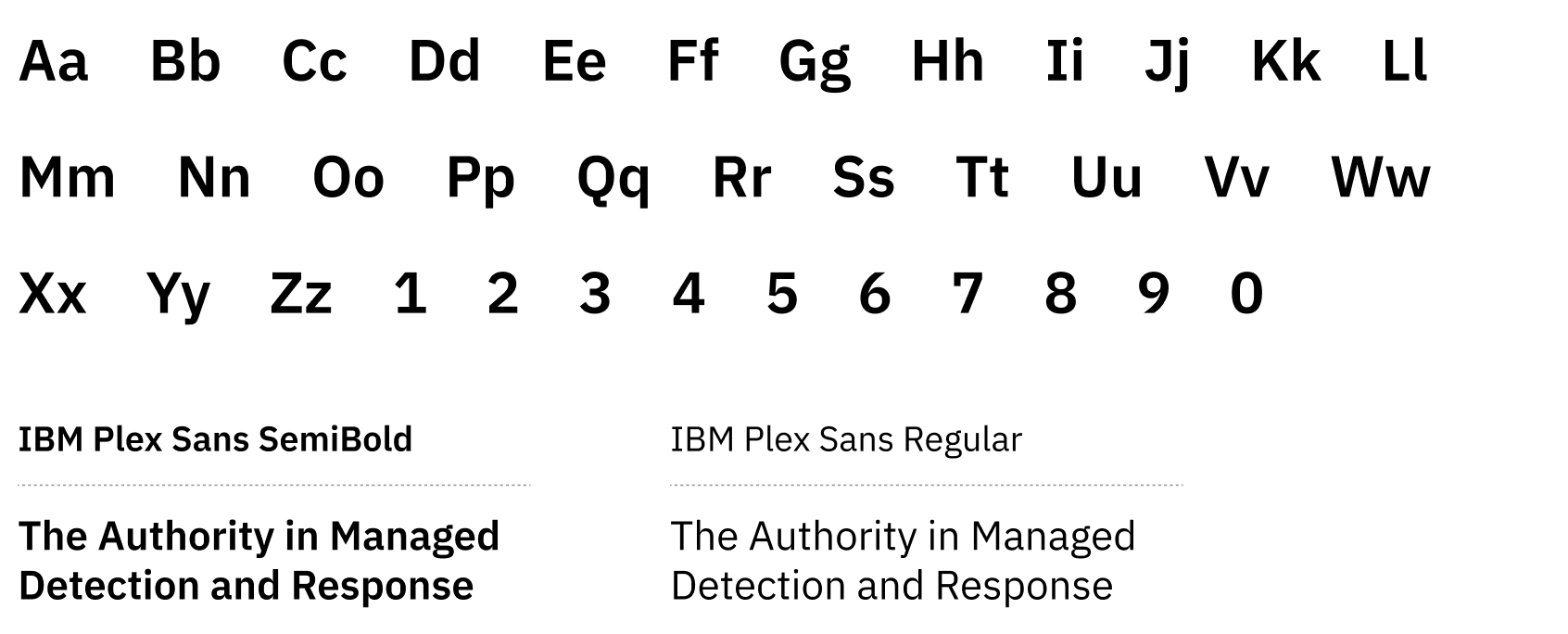
Primary Typeface: IBM Plex Sans
IBM Plex Sans is our primary typeface, used for all approved outward-facing marketing materials.
-
IBM Plex Sans Bold: For titles and headings
-
IBM Plex Sans SemiBold: For sub-headings
- IBM Plex Sans Regular: For body copy
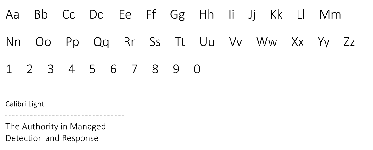
Alternate Typeface: Calibri Light
IBM Plex Sans is our primary typeface, used for all approved outward-facing marketing materials.
-
Calibri Light (bolded): For headings
- IBM Plex Sans SemiBold: For sub-headings
- IBM Plex Sans Regular: For body copy
Do not use Calibri for outward-facing materials, such as ads, flyers, or the website.
Type Hierarchy
Type hierarchy organizes text for easy readability, guiding readers from headings to body copy.
Consistent use of hierarchy ensures clarity across all eSentire materials.
EYEBROW (H6)
IBM Plex Sans Bold
Font size: 16 pt
Letter spacing: 150 pt
title (h1)
IBM Plex Sans Bold
Font size: 48 pt
Letter spacing: -20 pt
Sub-headline (h3)
IBM Plex Sans SemiBold
Font size: 36 pt
Letter spacing: 0 pt
PARAGRAPH (p1)
IBM Plex Sans Regular
Font size: 24 pt
Letter spacing: 0 pt
CALL-TO-ACTION TEXT
IBM Plex Sans Bold
Font size: 18 pt
Letter spacing: 150 pt
THE AUTHORITY IN MANAGED DETECTION AND RESPONSE
Choose Proven.
Partner with the Authority in MDR.
Prevent cyber threats from becoming business-disrupting events with eSentire MDR
Protect your business and critical processes with our complete, multi-signal Managed Detection and Response (MDR) service.
Color Scheming
THE AUTHORITY IN MANAGED DETECTION AND RESPONSE
Choose Proven.
Partner with the Authority in MDR.
Prevent cyber threats from becoming business-disrupting events with eSentire MDR
Protect your business and critical processes with our complete, multi-signal Managed Detection and Response (MDR) service.
Block Quotes
QUOTATION MARK
The quotation mark should be at least 25 px in height
PULL QUOTE
IBM Plex Sans Regular
font size: 30 pt
letter spacing: 0 pt
line spacing: 40 pt
ATTRIBUTION
Quotee
IBM Plex Sans Bold
font size: 20 pt
letter spacing: 0 pt
Quotee
IBM Plex Sans Regular
font size: 16 pt
letter spacing: 0 pt
The alerts and recommendations provided by the eSentire SOC team puts us in a much better position to defend ourselves against attacks.