BRAND

The eSentire Logo
eSentire’s main logo is a clean and simple wordmark. This is the primary logo used across all major brand touchpoints, making it easy for our audience to recognize eSentire’s digital presence.
To maintain the brand's strength and clarity, please remember to always follow these guidelines and handle the logo with care and respect in every use.
Minimum Clear Space
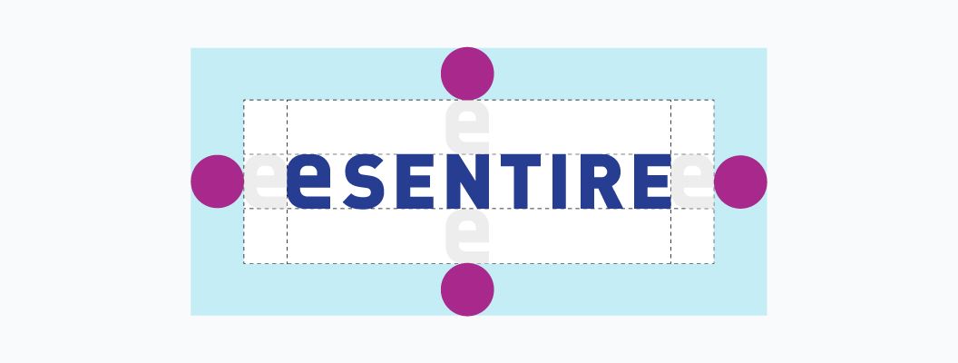
To preserve the eSentire logo’s integrity, always maintain a minimum clear space around it, equal to the full height of the first “e.” This ensures the logo stays distinct and unaltered. Please avoid adjusting the spacing within the logo’s lockup.
Minimum Size
For optimal clarity and recognition, the eSentire logo is best displayed at a minimum width of 100px for digital use and 35mm for print. Keeping to these sizes ensures the logo’s visibility and impact remain strong across all applications.

Variants and Proper Use
eSentire’s logo includes several approved variants for different contexts. Choosing the right version based on background, scale, and media helps maintain a consistent and professional brand appearance. Follow these guidelines to ensure proper use.
The preferred logo treatment is the blue (primary) eSentire logo on a white background.
On solid or dark backgrounds, always use the inverse version of the eSentire logo.

The blue (primary) eSentire logo is for use on light backgrounds or non-conflicting colors only.
Use the dark navy eSentire logo for monotone applications.

Use the inverse version of the eSentire logo on gradient backgrounds.
For questions about logo usage, please contact our design team at [email protected].
Improper Use
To preserve the integrity of the eSentire brand, it’s essential to avoid improper logo usage, such as altering its proportions, colors, or placement. Following these guidelines ensures our brand remains professional and visually consistent.
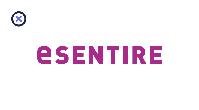
Don’t alter the color of the logo.
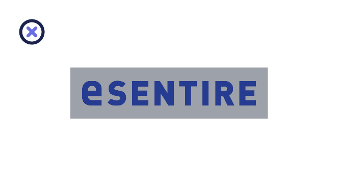
Do not place the logo within a shape or box.
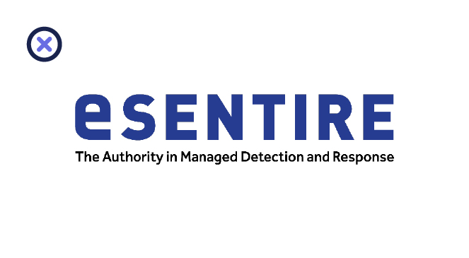
Don’t lock up any text or elements with the logo.

Don’t use the eSentire “e” on its own without permission from the brand/design team.
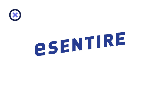
Don’t skew or stretch out the logo.
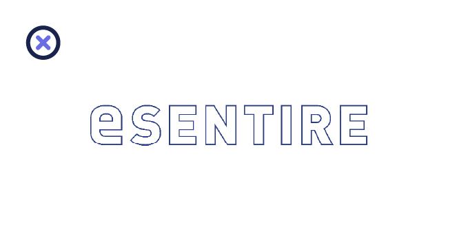
Don’t outline the logo.
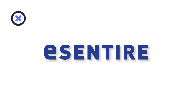
Don’t add effects or embellishments to the logo.
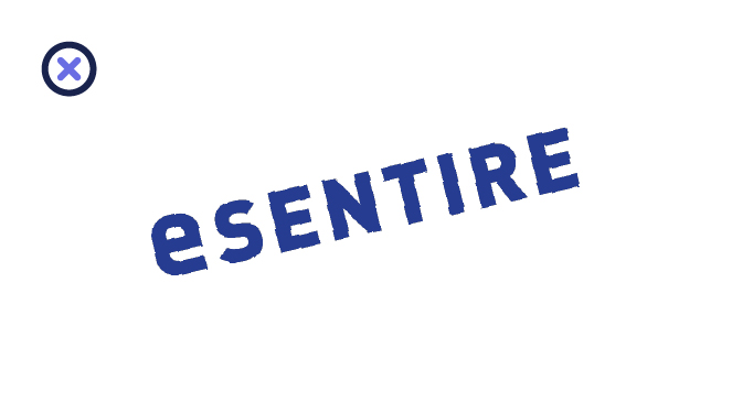
Don’t rotate the logo.
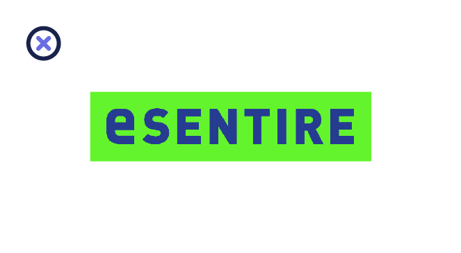
Don’t place the logo on any solid background that isn’t brand-approved.
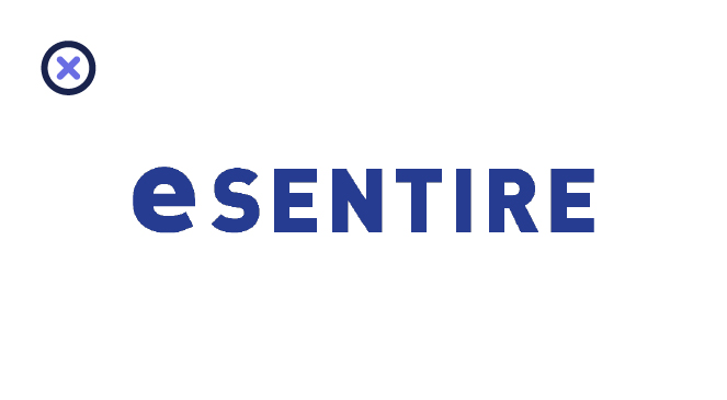
Don’t alter the logo’s composition.
For questions about logo usage, please contact our design team at [email protected].
Partner Logo Lockup
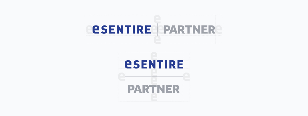
The partner logo lockup is designated for communications related to approved eSentire partnerships. The eSentire logo should always appear before the partner logo, positioned either to the left or above it.
Ensure clear space around both logos, equal to the height of the first “e” in eSentire, with a vertical or horizontal line dividing the logos. Both logos should be center-aligned.
Please follow these additional guidelines:
- Do not incorporate the eSentire name or logo into your own branding.
- Do not use the eSentire logo in any advertising without approval.
- Do not use eSentire brand elements on collateral or merchandise without approval.
Download the Logo Kit
Access the official eSentire logo files for use in approved communications. Ensure all usage aligns with our brand guidelines to maintain consistency and brand integrity.